7 Best KPI Software Tools (2026 Comparison, Fully Refreshed)

Founder, Grow Predictably · 15+ yrs building B2B revenue systems
By Brian Shelton — Founder of GrowPredictably.com
TL;DR: The best KPI software tool is the one your team actually opens after the first month. Feature count predicts nothing about that. I re-verified all 7 picks against their real 2026 status for this comparison, including Domo’s pending sale to Progress Software and a security-driven swap out of Sisense, because a dashboard only earns its place once it survives contact with a real team’s Monday morning.
Key Takeaways
- Most KPI dashboards go unused within a month because teams pick tools off a feature checklist instead of picking for who specifically needs to see which number, and a PwC survey found 56 percent of teams still track performance manually in spreadsheets despite KPI software being widely available.
- Good KPI software passes four tests: it surfaces the 3 to 5 numbers a specific role actually needs, it updates without manual data-wrangling, it is understandable to the person acting on it, and it survives a basic vendor-stability check.
- Progress Software agreed in July 2026 to acquire substantially all of Domo’s AI and data platform business for about 400 million dollars, with Domo expected to rename after the deal closes later in 2026.
- This list replaces Sisense with Databox after a CISA-disclosed customer data breach tied to Sisense, a vendor-stability signal most tool roundups skip entirely.
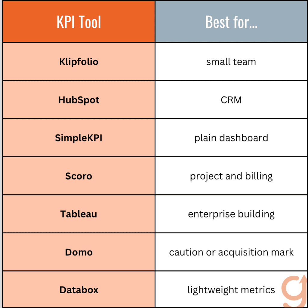
- Team fit beats feature count: a lean team fits Klipfolio or SimpleKPI, a HubSpot-native team fits HubSpot’s own KPI tracking, an agency billing by project fits Scoro, and an enterprise analytics team fits Tableau.
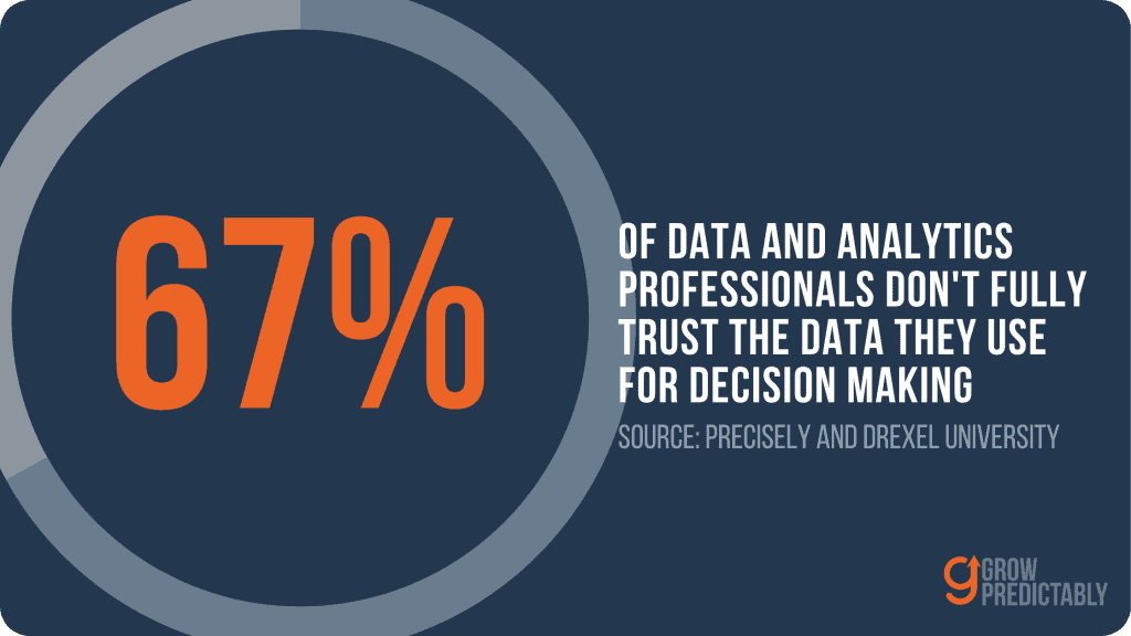
- A KPI dashboard is only working once the team stops re-exporting it to a spreadsheet to double-check it, a trust gap that is measurable: 67 percent of data professionals don’t fully trust the data they use for decisions, per Precisely and Drexel’s LeBow College of Business.
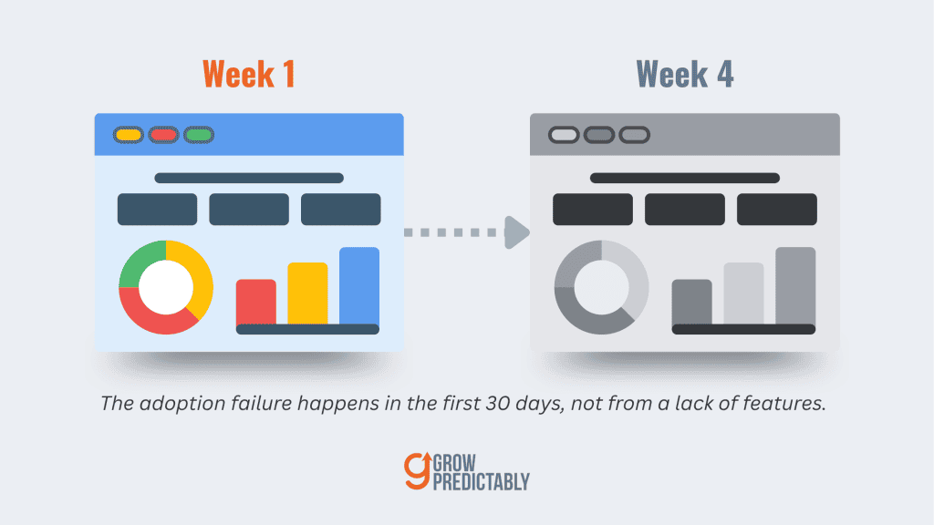
B2B teams that adopt a new KPI tool almost always follow the same arc. Week one produces four or five dashboards. Week four, almost nobody opens them, and the team is back to pulling numbers into a spreadsheet before a Monday pipeline review. The upstream problem is rarely the tool’s feature list. It is that the dashboards got built for what the tool could show.
Nobody built them for the specific person who has to act on a specific number. This is for the CMO, VP of Marketing, or fractional CMO who already owns a KPI tool nobody trusts. They are about to buy another one off the same checklist that produced the first miss. I checked all 7 tools below against their actual 2026 status before writing this.
That includes a vendor-stability pass most roundups skip entirely: is the vendor itself still standing.
Why does most KPI software end up unused after the first month?
Most KPI dashboards go unused within a month because the tool got picked off a feature list. Nobody picked it for the one person who actually needs to check one number every week. A team can own the most capable KPI platform on the market. It can still go dark by week four if nobody owns that weekly check.
The pattern is visible inside the first 30 days. The dashboards from week one covered pipeline, spend, and lead volume, built for what the tool could technically show. A VP of Marketing needs one pipeline-health view. A demand-gen manager needs a different one, tracking cost per lead at the campaign level.
When the setup skips the step of asking who needs which view, the tool builds dashboards nobody asked for. The two or three views people actually need never get built.
The common fix is buying a more powerful platform. A more powerful tool pointed at the same undefined audience just produces a more impressive dashboard nobody opens. It is one more line item on the subscription list with the same week-four fate.
The scale of the underlying habit is measurable. A PwC survey found that 56 percent of respondents still use manual processes and spreadsheets to track performance indicators, despite KPI software being widely available and, in many of those cases, already paid for.
Every tool compared below gets judged on who it actually fits, a specific role and team size, not on how many boxes it checks on a feature comparison chart.
What should good KPI software actually do for you?
Good KPI software passes four tests before it is worth paying for. It surfaces the 3 to 5 numbers that matter to one specific role, and it updates without manual data-wrangling. It is understandable to the person who has to act on it, and it survives a plain vendor-stability check most roundups skip.
The first three criteria show up in nearly every buyer’s guide. The fourth does not, and it is the one that changed two of the seven picks in this comparison. A tool can meet the first three tests perfectly and still be the wrong recommendation.
That happens when the vendor itself is mid-acquisition or sitting on an unresolved security incident nobody flagged. One tool that used to sit on lists like this one had a CISA-disclosed customer data breach, the kind of fact a feature-by-feature comparison never surfaces.
That fourth test is the same discipline behind evaluating any AI marketing tool without creating more subscription sprawl, narrowed here to KPI dashboards specifically.
Agency teams face the same screen one layer down, when the tools under evaluation are the ones doing SEO delivery. Choosing AI tools for SEO agencies applies the discipline to that stack.
The 7 best KPI software tools right now
The 7 tools below are worth considering right now, re-verified against their actual 2026 status. Two things changed since last year. Domo is mid-acquisition by Progress Software, and this list swaps out a prior pick after a vendor security incident most competitor roundups do not flag.
Klipfolio, for a lean team that wants dashboards without a data team
Klipfolio stays a solid fit for a lean marketing team of 2 to 5 people. It suits a team that wants to build its own dashboards without hiring a dedicated data analyst. I checked Klipfolio’s 2026 release log before including it here. It shows active updates through the middle of the year, with no ownership or stability concerns.
It connects to the ad platforms and CRMs a lean team already runs without much custom engineering. That is the real reason a team without a data function can stand it up in days rather than months. The tradeoff: the flexibility that makes it lean also means someone on the team has to own the setup.
It will not configure itself around your specific KPIs. That ownership question is the same one this whole comparison is built around, so confirm who that person is before you buy.
HubSpot, for a team already living in HubSpot for marketing and sales
HubSpot’s own KPI Software product tracks marketing and sales performance natively inside the platform teams already use daily. That is its real advantage. The KPI view sits behind the same login your sales and marketing teams already use for everything else.
There is no second tool to remember to open. The limitation: it is strongest for a team that already runs its pipeline inside HubSpot. It gets thinner once you need to pull in numbers from tools outside that ecosystem, since it was never built to be a general-purpose BI layer.
SimpleKPI, for a straightforward, no-frills KPI dashboard
SimpleKPI is the plainest tool on this list, a dashboard-and-report builder with no attempt to be anything more. Its January 2026 product update added in-app video walkthroughs and an AI support assistant. It is a small release, but a real sign the smallest vendor on this list is still shipping.
It works best once your KPI list is already settled. You mainly need a clean, reliable place to display and report on it, not a tool to help you figure out what to measure in the first place. The limitation is honest: it carries fewer features than the enterprise picks below.
That is exactly the point for a team that wants a dashboard, not a platform to administer.
Scoro, for a team that wants KPIs inside the same platform as projects and billing
Scoro folds KPI dashboards into the same platform as project management and billing. That fits an agency or services team that bills by project. In 2026 it added ELI, an AI companion that automates report generation and surfaces insights, on top of the native revenue and cost forecasting it already ran.
A team already tracking utilization, project margin, and billable hours somewhere else gains something real here. Folding KPI dashboards into that same system removes one more login and one more place the numbers can drift out of sync.
The tradeoff: you are buying into Scoro’s whole operating model, not just its dashboards. That makes it a poor fit for a team that only wants the KPI layer and nothing else.
Tableau, for an enterprise team that needs deep, governed analytics
Tableau remains the deepest enterprise analytics option on this list. It is built for a team with a dedicated analytics function and governance requirements. Salesforce moved Tableau Next to role-based pricing in 2026, replacing the older per-query Flex-credit model for core usage.
Data storage and a few other line items still bill separately. That shift is worth confirming directly with a rep before budgeting. The limitation stays the same as it has always been. This is more platform than a small marketing team needs, and the learning curve reflects that scale.
It rewards a team with the analyst headcount to build and maintain the underlying data models. For a marketing team of three trying to watch five numbers, it is overkill.
Domo, and the acquisition you should know about before you buy
Domo is worth naming plainly before you buy it. Progress Software agreed in July 2026 to acquire substantially all of Domo’s AI and data platform business for about 400 million dollars, with Domo expected to change its name once the deal closes later in 2026. That is a fact to watch, not a reason to panic.
The product itself is expected to keep operating through the transition. Existing customers are not being told to migrate off the platform today. The ownership change is exactly the kind of fact this list’s fourth test exists to catch.
A team evaluating Domo right now should still ask the vendor directly what the acquisition changes before signing a multi-year contract.
Databox, this year’s swap in for Sisense, and why
This list drops a prior pick, Sisense, and swaps in Databox instead. CISA publicly disclosed a Sisense customer data breach in 2024 tied to exposed credentials and secrets. Recommending Sisense without naming that risk would be stale due diligence.
Databox is built specifically around tracking the metrics and KPIs that matter most, and I found no CISA advisory or comparable public breach disclosure for it. Its own product-updates page shows a steady release cadence into 2026, the same currency check the other six picks on this list get. It pulls metrics from the ad platforms, CRMs, and analytics tools a marketing team already runs.
Nobody on the team has to become its own BI department to use it. It fits a team that wants a lightweight, cross-platform metrics view rather than a full BI suite.
Which KPI tool actually fits your team?
The right KPI tool is a match to your team’s actual profile. A lean team, a HubSpot-native team, a services team billing by project, and an enterprise analytics team need four different picks. Each fits a different one of the 7 tools above. Matching correctly is what actually gets a dashboard opened every week.
Match your team to the tool, not the tool to a feature list:
- A lean marketing team of 2 to 5 people: Klipfolio or SimpleKPI, both built for a team without a dedicated data analyst.
- A team already running pipeline and campaigns inside HubSpot: HubSpot’s own KPI tracking, since the numbers already live there.
- A services or agency team billing by project: Scoro, because KPIs, projects, and billing sit inside the same platform.
- An enterprise team with a dedicated analytics function: Tableau, for the governed, deep-analytics fit the smaller tools do not attempt.
- A team that wants a lightweight, cross-platform metrics view without adopting a full BI suite: Databox.
Feature count is the wrong first filter. The instinct to default to whichever tool has the biggest logo wall or the most reviews skips this test entirely. That instinct is exactly how a stale, security-risky pick stayed on comparison lists this long.
The right filter is who on your team will actually open this dashboard every week, starting with the one number that person needs to see first. Most teams working through this decision are also mid-evaluation on marketing attribution software or a shortlist of AI content tools, and the same who-actually-opens-it test applies to both.
How do you know if your KPI dashboard is actually working?
A KPI dashboard is working once the team trusts the numbers enough to act on them without re-checking a spreadsheet first. If people are still exporting the dashboard to verify it, the tool has not replaced the old habit yet. It has only added a step on top of it.
That re-export habit is the honest test, and the trust gap behind it is measurable, not just a feeling. Precisely and Drexel University’s LeBow College of Business surveyed more than 565 data and analytics professionals and found that 67 percent don’t completely trust the data they rely on for decisions, up from 55 percent the year before.
The trust gap has a name attached to it too. Michael Schrage, a Research Fellow at the MIT Sloan School of Management Initiative on the Digital Economy, put it plainly:
Your KPIs are your strategy. Your strategy is your KPIs.
Michael Schrage, Research Fellow, MIT Sloan School of Management Initiative on the Digital Economy
A dashboard nobody trusts fits that warning exactly. It is decoration. It only becomes a strategy tool once the team stops re-exporting it to double-check the numbers. That gap rarely closes with a redesign.
It closes once the numbers survive enough checks against the source system that people finally stop bothering to check. (Source: MIT Sloan Management Review)
Where do you start with your own KPI dashboard?
I checked all 7 tools above against the same four tests before publishing this comparison, which is why two of the seven changed. Run the same discipline on your own shortlist: pick the tool that matches your team’s actual profile, not the one with the most features on the page, then name the one number your team will check first and who owns checking it.
That same discipline, score honestly before you fix anything, is what Rate My Funnel applies across your whole customer journey. It is the natural next step once your KPI tool is finally the one people actually open.
Score your funnel honestly before you add another tool.
Frequently Asked Questions
Which KPI software is best for a small business?
For a small business or lean marketing team of 2 to 5 people, Klipfolio or SimpleKPI are the strongest fits among the 7 tools compared here. Both are built for a team without a dedicated data analyst, and neither requires the governance overhead that an enterprise platform like Tableau assumes from day one.
Is there a free KPI software option worth using?
Free tiers among these 7 tools vary and change often, so verify current terms directly with each vendor before you rely on one. Several offer a free trial or a limited free plan rather than a permanent free tier, and a demo-only offer is not the same thing as an actual free plan.
What happened to Domo, and should I still consider it?
Progress Software agreed in July 2026 to acquire substantially all of Domo’s AI and data platform business for about 400 million dollars, and Domo is expected to change its name once the deal closes later in 2026. The product itself is expected to keep operating, so Domo is still worth considering, but confirm the acquisition’s status directly with the vendor before signing a multi-year contract.
Why did this list drop Sisense?
This list replaces Sisense with Databox because CISA publicly disclosed a Sisense customer data breach tied to exposed credentials and secrets. Recommending Sisense without naming that risk would be stale due diligence for a buyer who screens vendors on security posture. Databox offers a comparable, purpose-built KPI and metrics fit with no comparable security concern found.
How long does it take to set up a KPI dashboard?
A basic KPI dashboard can go live within a day or two once you already know which 3 to 5 numbers matter to a specific role. Most of the real time cost sits upstream of the tool itself, in deciding who needs which number, not in the software configuration.
Do I need a data analyst to use KPI software?
For most of the 7 tools compared here, including Klipfolio, SimpleKPI, HubSpot, Scoro, and Databox, no dedicated data analyst is required. Tableau is the exception. Its enterprise-grade analytics depth rewards a team with the analyst headcount to build and maintain the underlying data models.
About the author
Brian helps B2B founders install marketing + automation engines powered by Co-Thinking with AI. With 15+ years building predictable revenue systems, he's worked with SaaS, agency, and service businesses on 90-day done-with-you growth accelerators.
Ready to see your real growth gap?
Two minutes in the Growth Gap Scan and you walk away knowing the one thing capping your pipeline. Free, no obligation.