Mobile SEO: How to Rank When Google Only Sees Your Mobile Site

Founder, Grow Predictably · 15+ yrs building B2B revenue systems
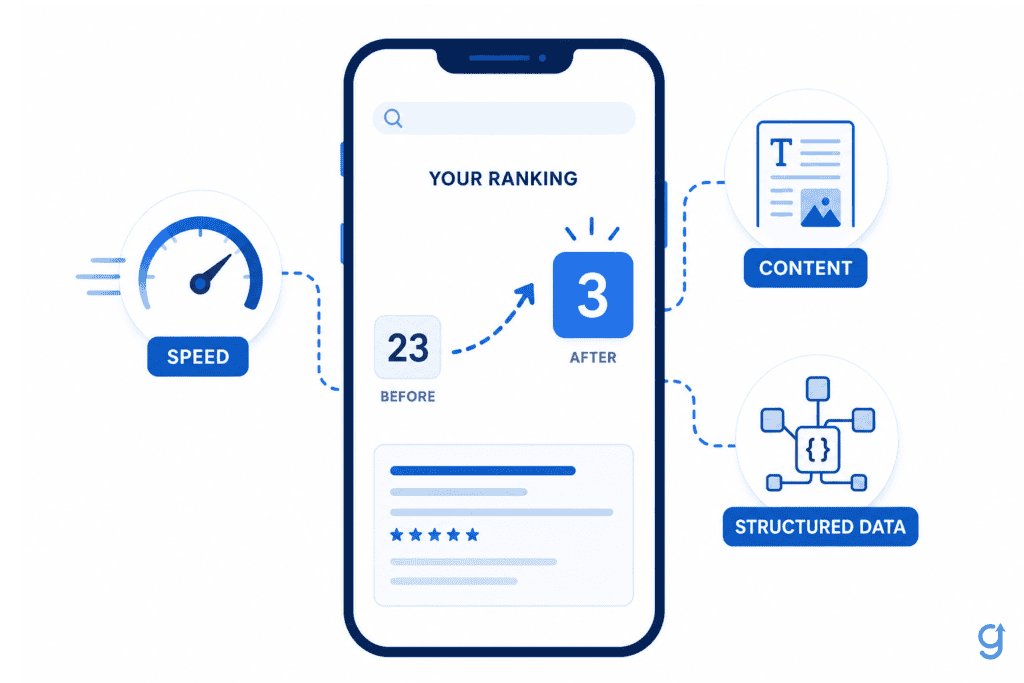
TL;DR: Mobile SEO is optimizing your site’s mobile version, the only version Google actually indexes and ranks since its mobile-first rollout finished in 2023. A site can look mobile-friendly on a phone and still rank poorly, because the real problems (missing content, slow real-world load times, broken structured data) are structural, not visual.
Key Takeaways
- Mobile SEO means optimizing the mobile version of a site because Google’s mobile crawler is now the primary, near-universal basis for indexing and ranking.
- Google confirmed its mobile-first indexing rollout was complete on October 31, 2023, and by mid-2024 mobile crawling was the default for essentially every indexed site.
- A site can pass a casual “looks fine on my phone” check and still rank poorly, because content parity gaps, slow real-world speed, and broken mobile structured data are invisible without a real audit.
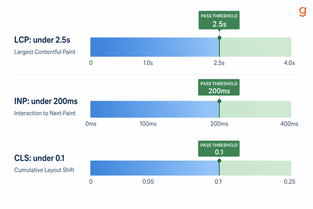
- Core Web Vitals thresholds for mobile are specific: Largest Contentful Paint under 2.5 seconds, Interaction to Next Paint under 200 milliseconds, Cumulative Layout Shift under 0.1.
- Google’s own research shows 53% of mobile visits are abandoned when a page takes longer than 3 seconds to load, a cost that hits conversions even when rankings hold steady.
I have spent years watching marketing leaders hire and fire digital marketing agencies, from both the agency side and the in-house marketing-leadership side. The accounts that get fired for technical SEO rarely lose because the strategy was wrong. They lose because nobody checked what Google’s mobile crawler actually sees, and a client eventually finds out the hard way.
This article walks a B2B digital marketing agency through what mobile-first indexing changed. It covers a repeatable audit for finding mobile problems a phone glance won’t catch, plus the Core Web Vitals thresholds that decide whether a fast-looking page is actually fast.
This is for the operator or senior strategist doing marketing for a B2B digital agency, the one who owns technical SEO delivery across client accounts and has been asked why a mobile-friendly site is still stuck at position 70 or worse.
The work that follows is not “run the mobile-friendly test and move on.” It is auditing the mobile version like it is the only version that exists, because to Google, it is.
What is mobile SEO?
Mobile SEO is the practice of optimizing your site’s mobile version, so it actually ranks well in search results. That covers the speed, layout, content, and technical structure of your mobile pages, and it matters because Google indexes and ranks nearly every site based on its mobile version, not desktop.
If you’re a B2B SaaS marketing leader or founder deciding where your dev team’s time goes, this is the version of your site that determines your visibility.
Here’s what trips people up: a responsive theme does not guarantee mobile SEO. I see this mistake constantly. Content, internal links, and page speed can all differ between what a desktop visitor sees and what a mobile crawler actually finds, even on a “responsive” site.
“Mobile-friendly” and “mobile SEO” get used interchangeably, but they’re not the same thing.
- Mobile-friendly is a usability label. It asks whether a human can comfortably read and tap around a page on a phone.
- Mobile SEO is a full ranking discipline. It asks harder questions:
- Does the mobile version include every piece of content the desktop version has?
- Does it load fast on a real mobile connection, not just in a lab test?
- Is its structured data intact?
A site can pass a visual mobile-friendly check and still fail on all three counts.
Google’s own team has flagged this exact gap. John Mueller, Google Search Advocate, explains that when a mobile page’s navigation skips normal URLs, Google can struggle to index the mobile site at all. That’s a technical SEO failure a human eye would never catch just by looking at the page.
Why does mobile-first indexing make your mobile page your entire SEO surface?
Mobile-first indexing means Google crawls and ranks a page almost entirely using its mobile version. The legacy desktop crawler is now reserved for a small set of sites that genuinely do not function on mobile at all.
Google confirmed the rollout was complete on October 31, 2023, capping a transition that started back in 2016. Google’s own announcement framed it as the end of a long journey, one they were glad to close out finally.
If you run or manage client sites at a B2B digital marketing agency, this changes how you have to think about every property in your portfolio. It is not “make sure mobile works too.” The mobile version is the site, as far as Google is concerned. That has real consequences:
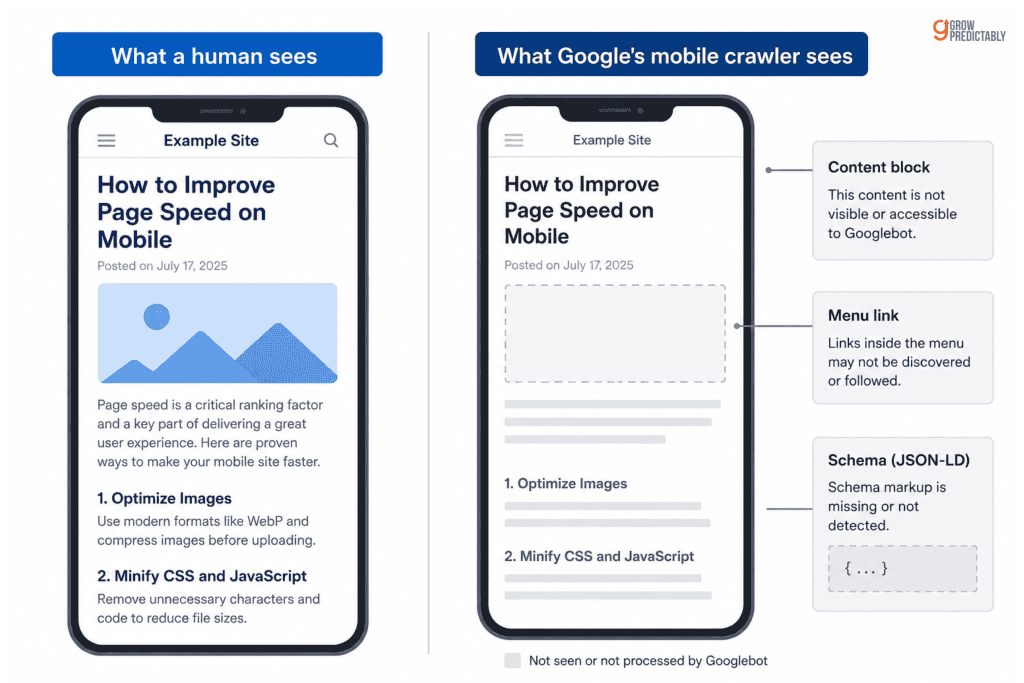
- Content trimmed out of a mobile template does not exist for ranking purposes. If it’s not there, Google can’t rank it.
- Links hidden behind a collapsed mobile menu don’t count either, since a crawler can’t follow what it can’t reach.
- Structured data that only fires on the desktop template gets ignored entirely.
A person browsing on desktop can see it all fine. Google’s mobile crawler cannot. That gap, between what a human sees and what Google actually indexes, is exactly what the next section covers.
Why do mobile-optimized-looking sites still rank poorly?
A site can look completely fine on a phone, pass a quick eyeball test, and still sit at a weak position, because the real problems are structural, not visual. That’s the symptom most marketing operators notice first: mobile traffic and mobile ranking stay flat despite a responsive theme already being in place.
I see this constantly with clients who assume “responsive” means “optimized.” The real cause sits underneath what a human glance can catch:
- Content or links present on the desktop template get quietly stripped from the mobile template. Accordions, tabs, and conditional rendering are usually the culprits.
- Real-world mobile load times run far slower than a quick office wifi test suggests. Most mobile visitors are on a phone network, not fiber, so your actual load time is worse than what you’re testing on.
- Structured data gets implemented once on the desktop template and never ported to the mobile one. Google never sees it.
- Intrusive interstitials block content on first load, a pattern Google has flagged as a mobile usability problem since 2017.
None of these show up if you check a site by opening it on your own phone. They only surface when you check what Google’s mobile crawler actually receives, not what a human eye sees. That gap, between what you can verify by looking and what Google is actually indexing, is exactly what the audit in the next section is built to close.
How is mobile SEO different from desktop SEO?
The core mechanical difference is this: desktop SEO used to tolerate parity gaps between what different crawlers saw. Mobile SEO doesn’t, because the mobile crawler’s view is now the only view that counts for ranking. That’s the one-sentence answer. Everything else is what it means in practice.
If you’re at an agency walking a client through this, here’s what actually changes day to day:
- Screen size forces a stricter content hierarchy. The most important information has to sit above a much smaller fold, so you can’t rely on a wall of text to eventually get to the point.
- Touch targets need real spacing. A button sized for a mouse cursor is often too small for a thumb, and that’s a usability issue that becomes an SEO issue once it affects engagement.
- Mobile carries a tighter speed budget by default. Mobile networks and devices are slower than desktop, so the same page has less room to breathe on speed, even before you touch a single word of content.
- Keyword intent itself can shift on mobile. The same query often carries more immediate, near-me, or voice-adjacent intent on a phone than it does on a desktop search.
None of these are cosmetic. They’re the practical differences that separate a site that merely displays on mobile from one that’s actually built for it.
How do you audit a site for mobile SEO issues?
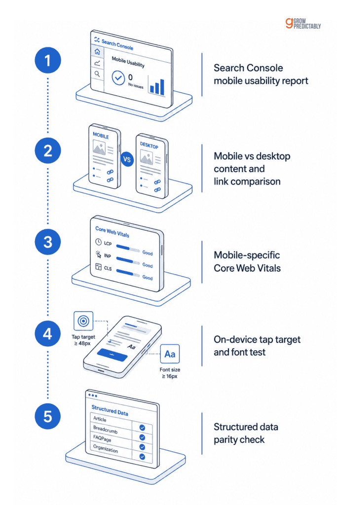
The fastest reliable way to find real mobile SEO problems is a five-step audit, not a visual glance at a page on a phone. Each step targets one of the invisible root causes covered above.
- Run Google Search Console’s mobile usability report to catch crawl and rendering errors Google is already flagging.
- Compare the mobile and desktop versions of key pages side by side using a mobile user-agent fetch, not just a resized browser window, to confirm content and links actually match.
- Check Core Web Vitals scores filtered specifically for mobile, not the blended average, since mobile performance is almost always worse than desktop.
- Test tap-target spacing and font legibility on an actual device. A browser resize does not reproduce a real thumb tapping a real screen.
- Confirm structured data renders identically on the mobile template, since schema implemented only on desktop provides zero benefit for a mobile-indexed page.
This same checklist works as a repeatable process across every client account an agency runs. That consistency matters more than any single fix. Choosing the right audit tooling is what makes running it across dozens of accounts actually realistic.
Fixing the most common mobile SEO problems
Once the audit above surfaces a gap, the fix is usually direct. In my experience working with B2B SaaS and agency clients, these are the three problems that show up most often.
Content or links missing from the mobile version
Restore anything hidden behind accordions, tabs, or conditional rendering that a mobile crawler cannot reach. If a piece of content matters enough to rank for, it needs to exist in the mobile DOM, not just be revealed by a click a crawler never makes.
Interstitial popups blocking the page
Replace full-screen popups on page load with a less intrusive banner or a delayed trigger. Google has treated intrusive interstitials as a mobile usability and ranking issue since 2017, and the fix rarely costs more than a design pass.
Font size and tap-target spacing
Follow accessible sizing minimums, roughly 48 pixels for tap targets and 16 pixels for base font size, so a visitor can read and navigate without pinching to zoom. Pinch-to-zoom usage is itself a signal that the page failed its own usability test.
Why do Core Web Vitals matter for mobile rankings?
Core Web Vitals are three specific performance metrics Google treats as part of its page experience ranking signals, and mobile is where they matter most because mobile devices and networks are typically slower than desktop by default.
If you’re an agency bringing this up with a client, here are the exact numbers you’re working against. The thresholds are precise:
- Largest Contentful Paint should occur within 2.5 seconds.
- Interaction to Next Paint should stay under 200 milliseconds.
- Cumulative Layout Shift should stay under 0.1.
All three get measured at the 75th percentile across real user sessions, on both mobile and desktop.
The business case for bringing this to a client isn’t just about ranking. Google’s own research puts a hard number on it: over half of visits are likely to be abandoned once a page takes more than three seconds to load. That’s a conversion loss that happens before a ranking ever moves, on a page a client may already believe is “fast enough.”
Mobile content and UX changes that actually move rankings
Not every mobile change matters equally. In my experience, these are the three that consistently move rankings, versus the cosmetic tweaks that don’t.
- Content hierarchy has to front-load the direct answer before supporting detail. Mobile visitors scroll past long preambles far more aggressively than desktop visitors do, so if your answer is buried in paragraph three, most mobile readers never see it.
- Structured data parity means confirming that schema markup implemented on desktop actually renders on the mobile template too. A crawler that only sees the desktop version gets no benefit from it, no matter how well the schema is built. And technical foundations like structured data feed directly into how AI-powered search surfaces cite a page, so getting mobile parity right here pays off beyond traditional rankings.
- Local and voice-adjacent intent is worth naming too. Many mobile searches carry near-me or immediate-need intent even for keywords that have nothing to do with location, so mobile content should answer the implicit question as directly and quickly as the format allows.
If you’re advising a client on where to spend limited dev time, this is the priority order. Everything else is polish.
How do you track mobile SEO performance over time?
Filter Google Search Console performance data by device to see mobile-specific impressions, clicks, and position, not a blended total that hides what is actually happening on the version of the site that counts.
Compare mobile and desktop traffic and conversion trends over time, not just once. A regression gets caught early instead of after three months of stagnant impressions. Mobile SEO is not a one-time fix. It is an ongoing audit. Google adjusts mobile ranking signals often enough that a site that passed last year’s check can quietly fail this year’s.
The same audit-first instinct applies one level up, past a single technical fix and into the whole growth funnel. If content, links, or speed problems can hide in plain sight on a single page, the same is usually true of the funnel around it.
Find your real growth gap with the free scan (the same diagnose-before-you-fix approach applied to the full funnel, not just the mobile page).
Frequently Asked Questions
What is mobile SEO?
Mobile SEO is optimizing a website’s mobile version, its speed, layout, content, and technical structure, so it ranks well in search. Google indexes and ranks nearly every site based on its mobile version rather than desktop, so a page that only performs well on desktop gets no ranking credit for that.
Is mobile SEO different from desktop SEO?
Yes. Desktop SEO used to tolerate gaps between what different crawlers saw, but mobile SEO does not, because the mobile crawler’s view is now the only view that counts for ranking. Mobile SEO also has to account for smaller screens, touch targets, and a tighter speed budget than desktop.
What is mobile-first indexing?
Mobile-first indexing is Google’s practice of crawling and ranking a page almost entirely using its mobile version. Google confirmed the rollout was complete on October 31, 2023, with the legacy desktop crawler now reserved for a small set of sites that do not function on mobile at all.
How do I check if my site is mobile-friendly?
Start with Google Search Console’s mobile usability report to catch crawl and rendering errors Google is already flagging. Then compare the mobile and desktop versions of key pages using a mobile user-agent fetch, since a visual check on your own phone will not catch content or link gaps.
Does page speed affect mobile SEO rankings?
Yes. Core Web Vitals, which measure loading speed, interactivity, and visual stability, are part of Google’s page experience ranking signals, and mobile performance is typically worse than desktop by default. Google’s own research also shows 53 percent of mobile visits are abandoned when a page takes longer than 3 seconds to load, a conversion cost separate from ranking.
How often should I audit a site for mobile SEO issues?
Treat it as an ongoing process, not a one-time fix. Google adjusts mobile ranking signals often enough that a site which passed last year’s check can quietly fail this year’s, so filtering Search Console data by device on a recurring basis catches regressions before they compound.
Do intrusive mobile popups hurt SEO?
Yes. Google has treated intrusive interstitials that block content on page load as a mobile usability and ranking issue since 2017. Replacing a full-screen popup with a less intrusive banner or a delayed trigger resolves the issue without much design cost.
About the author
Brian helps B2B founders install marketing + automation engines powered by Co-Thinking with AI. With 15+ years building predictable revenue systems, he's worked with SaaS, agency, and service businesses on 90-day done-with-you growth accelerators.
Ready to see your real growth gap?
Two minutes in the Growth Gap Scan and you walk away knowing the one thing capping your pipeline. Free, no obligation.