B2B SaaS Landing Page Conversion: The Ultimate Guide to Profit
Your landing page should be your biggest sales tool—but right now, it isn’t delivering.
Visitors arrive, look around, and leave without taking action.
Sound familiar?
Here’s the fix: we’ll walk you through proven techniques to create the best B2B SaaS landing page conversion
With tailored CTAs and trust signals, we’ll help you stop losing leads.
Apply these insights, and you’ll finally turn traffic into paying customers.
Ready to optimize your pages and see results?
Let’s dive in!
What is a SaaS Landing Page?
Let’s talk landing pages.
Specifically, how to make SaaS landing pages successful for B2B SaaS.
Your landing page isn’t just any webpage; it’s the gateway to potential clients and future sales.
A well-designed landing page can set your product apart.
Think of it like this: a SaaS landing page is your software’s first impression.
A landing page should effectively highlight what makes your SaaS solution unique.
This refers to web pages specifically designed to convert visitors into leads or paying customers.
Effective SaaS landing pages create an immediate impact.
The focus?
A clear call to action (CTA), such as signing up for a free trial, booking a demo, or grabbing a white paper.
A high-converting landing page often includes these elements.
It’s all about showing off the software’s perks in a way that makes you want to click that button.
The best SaaS landing pages use compelling content.
Creating a high-converting landing page focusing on personalization, usability, and clarity is crucial to guiding users through their journey and improving engagement rates effectively.
Make sure your SaaS landing is tailored to your audience.
Relevant Statistics
- Conversion Rates: The average landing page conversion rate across all industries is 5.89%, but for SaaS, the conversion rates vary. Conversion rates for SaaS landing pages vary widely, reflecting the importance of tailored design and optimization strategies. One report found the average for SaaS landing pages to be 9.5%, whereas a different analysis highlighted a median conversion rate of 3.8%.
- Industry Benchmarks: The events and entertainment industry achieves the highest median landing page conversion rate at 12.3%, setting a high benchmark in comparison.
- Lead Generation: Over half of SaaS marketers reported getting less than 100 leads per month from their landing pages, indicating room for improvement in optimization strategies for lead generation efforts. (Powered by Search).
- Improvement Factors: Factors like load time, design, and CTAs can dramatically enhance landing page performance. For instance, reducing load time or optimizing design elements can significantly increase conversion rates (Landingi).
The Anatomy of High-Converting SaaS Landing Pages
If you aim for high conversion rates, your landing page has to nail several crucial elements.
A well-crafted landing page serves as the foundation for effective conversion strategies.
It’s not just about looking good; it’s about delivering a seamless, persuasive user experience.
Successful SaaS landing pages integrate functionality and aesthetics to capture user attention and drive action.
Creating effective high-converting landing pages involves a systematic approach, focusing on clear goals, capturing lead information, and understanding customer pain points to improve conversions and revenue generation.
Understanding what makes a SaaS landing effective will enhance these elements significantly.
Let’s break down the anatomy of the best SaaS landing pages so you can get the results you’re after.
Examining successful SaaS landing strategies will reveal insights that can transform your results.
1. Clear and Compelling Headline
First impressions count big time, even more for B2B landing pages.
The headline of your SaaS landing must capture attention immediately.
A strong headline sets the tone for the entire landing page, grabbing attention and communicating value instantly.
Your SaaS landing page headlines should be clear and direct.
It should communicate your value proposition succinctly – visitors need to know within seconds what makes your SaaS product worth their time.
Successful SaaS landing pages prioritize clarity in their messaging.
For example, instead of saying, “Our software helps you manage projects,” say, “Manage Projects Effortlessly and Boost Productivity.”
2. Engaging Visual Content
High-quality visuals are a cornerstone of effective landing pages, as they quickly convey your software’s value proposition.
Visuals in SaaS landing pages should highlight core features or benefits.
They play a crucial role in engaging your audience and guiding them through your landing page.
Include visuals on every SaaS landing to enhance user experience.
High-quality images and videos can communicate complex information quickly and effectively.
Video content is particularly impactful for SaaS landing pages.
A study by EyeView Digital found that video on landing pages can increase conversion rates by up to 86%.
3. Effective Call to Action (CTA)
The right CTA is a must-have for all successful landing pages, making it clear what the user should do next.
Strategic placement of CTAs in SaaS landing pages can drive conversions.
It should be impossible to ignore and make what the user needs to do next obvious.
Effective SaaS landing strategies prioritize prominent CTAs.
According to Unbounce, using specific and personalized CTAs can increase conversions by up to 202%.
4. Trust Elements and Social Proof
People trust people, not just brands.
Trust-building elements are crucial for SaaS landing pages.
For B2B landing pages, incorporating social proofs like testimonials, case studies, and client logos can significantly boost your credibility.
These elements must be seamlessly integrated into SaaS landing pages.
For example, studies highlighted by Nielsen show that 70% of people trust reviews and recommendations from strangers.
5. Simplified Forms
Forms are often conversion roadblocks. Simplified forms in SaaS landing pages assist in smoother conversions.
An optimized landing page form should ask for only the essential information, making it easier for users to convert without hesitation.
Aim for brevity in your SaaS landing forms.
Keep them short and simple to prevent form fatigue.
Adjust forms on SaaS landing pages to maintain user interest.
HubSpot found that reducing the number of form fields from four to three can increase conversions by up to 50%.
6. Quick Load Speed
Speed matters.
A slow-loading page can frustrate users and drive them away. Ensuring fast load times is essential for SaaS landing success.
Optimize your page to load quickly to keep potential customers engaged.
Efficient loading speeds are vital for SaaS landing pages that convert.
According to Google, a one-second delay in page load time can decrease conversions by up to 20%.
7. Mobile Responsiveness
Your landing page must look good and function well on all devices, especially mobile.
Mobile responsiveness is a critical consideration for SaaS landing pages.
For SaaS companies, a mobile-friendly design ensures that potential customers can engage and convert visitors seamlessly from any device.
SaaS landing pages must adapt to various screen sizes for optimal usability.
With over half of global traffic coming from mobile devices, mobile-optimized landing pages are no longer optional.
Mobile optimization is a must for SaaS landing pages today.
According to Statista, 52.6% of global web traffic comes from mobile devices, highlighting the importance of a mobile-friendly design.
5 Common Mistakes in SaaS Landing Page Design
So, you’ve crafted what seems like the perfect SaaS landing page, but those conversions just aren’t adding up.
A successful SaaS landing involves careful attention to detail.
Where did it go wrong?
Often, it boils down to a few key mistakes on your SaaS landing page. Each element of your landing page is crucial for maximizing conversions.
When users come to your SaaS landing pages, they’re looking for specific information, and if they don’t find it quickly and easily, they’ll bounce faster than you can say ‘goodbye.’
Let’s check out what might be flopping on your landing page.
Ensuring the effectiveness of your SaaS landing strategies involves avoiding these common pitfalls.
- Overwhelming or Confusing Design
A cluttered layout can drive visitors away. If a landing page bombards users with too much information or distracts them with chaotic visuals, they’ll likely struggle to find the call-to-action (CTA) or the unique selling proposition (USP). SaaS landing pages need to be clean and focused. Research shows that 38% of people will stop engaging with a website if the content or layout is unattractive. - Lack of Clear Value Proposition
What makes your product stand out from the crowd? If visitors can’t grasp your unique value quickly, they won’t stick around to find out more. Your landing page should highlight your SaaS’s benefits over its features and answer the question: Why should the visitor care? Successful SaaS landing pages communicate value effectively. Failing to clearly communicate your value proposition can make it difficult to convert visitors into leads or customers. - Ineffective Call-to-Action (CTA)
Your CTA is a crucial conversion tool. If it’s not clear or enticing, users will be left wondering what to do next. Maybe it’s buried under a mountain of text, hard to spot, or lacking urgency – all these can be conversion killers. It’s a good idea to make it stand out and ensure it communicates value. The design of SaaS landing pages must emphasize the CTA for better results. - Slow Page Load Time
A snail-paced loading screen? That’s a big no-no. A delay of just one second in page response can result in a 7% reduction in conversions. Your landing page needs to be swift – nobody enjoys twiddling their thumbs waiting for content. Optimizing SaaS landing pages for speed is essential. - Poor Mobile Optimization
With mobile devices accounting for more than half of all global internet traffic, a landing page that’s not mobile-friendly is a recipe for disaster. Mobile responsiveness is vital for SaaS landing pages today. If users have to pinch and zoom or deal with buttons that don’t work on their phones, they won’t stick around to sign up. Make sure your SaaS landing is designed for all devices.
Grab a fresh perspective on your landing page’s design and content strategy to boost those conversion rates.
Remember, a visitor-friendly page with clear messages and smooth navigation will always be your best bet.
10 Tips on Building Conversion-Focused SaaS Landing Pages
Creating a landing page that converts is like baking a cake; if you miss one key ingredient, the whole thing can fall flat.
The same goes for B2B landing pages.
A high-converting landing page guides visitors seamlessly toward conversion through thoughtful design and strategic elements.
Optimizing these landing pages is crucial for maximizing lead generation by capturing visitor information through forms.
1. Know Your Audience Inside Out
The aim of marketing is to know and understand the customer so well the product or service fits him and sells itself.
Peter F. Drucker
Start by understanding who you’re actually talking to.
Knowing your audience inside out allows SaaS companies to design landing pages that resonate and lead to higher conversions, ultimately enhancing results for your lead generation efforts.
When you know your audience’s pain points, desires, and browsing habits, you can tailor your message to resonate deeply with them.
This connection builds trust and makes users more likely to take that next step with you.
- Surveys: Reach out to your existing customers to gather insights about what they find compelling and what challenges they face.
- Analytics: Use tools like Google Analytics to find out how users are interacting with your current landing page.
- Feedback: Check customer reviews and testimonials on social media or platforms like G2 Crowd.
Knowing your audience guides everything from the language you use in your copy to the style of your visuals and is crucial for creating landing pages that are personalized and clear.
Effective landing pages can significantly improve engagement rates and guide users through their journey.
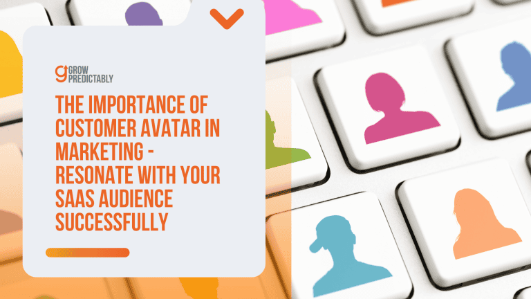
Using a Customer Avatar Canvas helps you get a crystal-clear picture of your target audience.
The more you understand your customers, the more you can tailor your message to resonate with them, significantly boosting your chances of conversion.
Why the Customer Avatar Canvas?
The Customer Avatar Canvas tool lets you create a detailed profile of your ideal customer.
It covers aspects like demographics, goals, challenges, and even their sources of information.
Let’s get actionable.
Fill out each section of the Customer Avatar Canvas to build a comprehensive customer profile.
- Demographics
Understand the basic characteristics. Are you talking to 35-year-old IT managers or 25-year-old startup founders? Knowing this shapes your tone and content. - Age, gender, location, profession
- Income level, education, industry
- Goals and Values
Is your audience looking to streamline workflows or reduce costs? Knowing their goals lets you position your product as the solution they need. - What objectives are they trying to achieve?
- What do they value most in a solution?
- Challenges and Pain Points
Identifying these pain points offers a lifeline, making your product the clear choice. - What obstacles are blocking their path?
- What are their biggest frustrations with current solutions?
- Sources of Information
This helps you place your content where they will see it and ensures you speak their language. - What blogs, websites, or forums do they visit?
- What influencers do they follow?
- Objections and Fears
Addressing these concerns directly on your landing page can alleviate fear and build trust. - What are their objections when considering a solution like yours?
- What risks do they perceive?
Here’s a quick breakdown of how to apply this knowledge:
- Demographic Alignment: Use images and language that reflect your audience.
- Pain Point Focus: Highlight how your product solves its specific challenges.
- Goal Matching: Showcase testimonials or case studies that align with their ambitions.
- Influencer Collaboration: Link or quote industry influencers they follow to increase credibility.
- Objection Handling: Include a FAQ section that tackles common objections head-on.
2. Nail That Headline
Your headline is often the first thing visitors see, so make it count.
It should grab attention immediately and communicate your value proposition clearly.
A weak headline can cost you potential conversions before potential customers even start scrolling.
- Be Clear and Concise: Avoid fluff. Make sure your headline explains what your product does and what problem it solves.
- Use Numbers: Headlines with numbers can increase engagement. For example, “Boost Your Productivity by 150% with Our Tool.”
- Ask a Question: Engaging questions can pique user curiosity. “Struggling with Project Management? There’s a Solution.”
Combine clarity and curiosity to craft a headline that hooks your audience and makes them eager to read more.
3. Highlight the Key Benefits
Focus on the benefits rather than just features.
People want to know how your product can make their lives easier or solve their problems.
Showcasing benefits in a straightforward way helps users quickly understand why they need your product.
- Feature-to-Benefit Mapping: For every feature you list, immediately explain the benefit. For example, “Real-time notifications to keep you updated instantly.”
- Use Bullet Points: Break down benefits into bullet points for easy readability.
- Customer Testimonials: Let your customers speak about the benefits they’ve experienced.
Benefits tap into emotions and use cases that resonate more profoundly than a list of technical specs.
4. Optimize Your Call to Action (CTA)
Your CTA is the linchpin for conversions, so it needs to punch above its weight.
It’s not just about positioning a button; it’s about crafting an irresistible prompt that makes users take that crucial next step.
Here’s how you can improve your CTA to skyrocket your conversions:
- Be Clear and Direct: Use action-oriented language. “Get Started,” “Sign Up Now,” or “Download Free E-book.” No room for ambiguity here.
- Create Urgency: Words like “Limited Time Offer” or “Act Now” can spur immediate action.
- Make it Stand Out: Use contrasting colors and compelling design to draw the eye. This isn’t the place for subtlety.
- Position Wisely: Place your CTA where it naturally fits in the user journey — usually after valuable content or convincing sales points.
5. Mobile Optimization is a Must
In a world where everything is connected, mobile is the key to success.
Marissa Mayer
With so many users browsing on their phones, a mobile-optimized landing page is non-negotiable.
According to Statista, over 50% of global web traffic comes from mobile devices.
If your page isn’t mobile-friendly, you’re likely losing out on a massive chunk of potential conversions.
- Responsive Design: Ensure your layout adjusts fluidly across different screen sizes.
- Touch-Friendly: Make buttons and links easy to tap without zooming in.
- Fast Load Time: Optimize images and leverage caching to keep load times under three seconds.
A seamless mobile experience can make or break your landing page’s success, ensuring you capture leads wherever they are.
6. Keep the Layout Clutter-Free
A cluttered landing page can overwhelm visitors and obscure your main message.
Keep your design clean and focused to guide users effortlessly to your CTA.
- Limit Colors and Fonts: Stick to a consistent color palette and font family to maintain brand coherence.
- Whitespace is Your Friend: Use spacing effectively to make your landing page content digestible.
- One Goal per Page: Focus on a single CTA or conversion goal to avoid distracting the user.
Clarity in design not only makes your page look professional but also makes it easier for visitors to process the information and take the desired action.
7. Utilize Social Proof
Nothing sells like a testimonial.
David Ogilvy
Convincing users to trust your product can be a steep hill to climb.
But with social proof, you can level the playing field.
People trust the experiences of others — it’s human nature. Incorporating social proof can turn skeptical visitors into loyal customers.
- Customer Testimonials: Real quotes from real customers. Authenticity builds trust.
- Case Studies: Detailed stories of success can provide context and proof.
- User Reviews and Ratings: High ratings and positive reviews can tip the scales in your favor.
- Trust Badges: Certifications, awards, or endorsements from reputable sources add credibility.
Harnessing social proof isn’t tricky; it’s about showcasing genuine experiences and approvals that can sway new customers.
Social proof, like client testimonials or reviews, is particularly persuasive for SaaS companies looking to establish credibility and drive conversions.
Make it easy for users to trust you by showing them why others have.
8. Simplify Your Forms
Long or complicated forms are a surefire way to lose potential leads.
People don’t want to spend ages filling out fields or battling unresponsive designs.
Making your forms simple and user-friendly can keep the momentum going and increase those all-important conversions.
- Keep It Short: Ask for the minimum information needed. Each additional field is a potential roadblock.
- Clear Labels: Avoid confusion with straightforward and specific labels. Your users should know exactly what’s needed.
- Inline Validation: Instant feedback for errors saves users from hitting ‘submit’ and seeing a page full of red error messages.
- Mobile-Friendly Design: Forms should be just as easy to fill out on a smartphone as on a desktop.
By simplifying your forms, you’re removing friction from the user experience.
A smoother process means higher completion rates, so streamline those forms and get ready for more leads.
9. Consistency Matters
Finally, ensure that your landing page is consistent with your overall brand voice and visuals.
Inconsistent messaging can confuse visitors and erode trust.
- Brand Colors and Logos: Use your established brand elements to create a cohesive look.
- Tone of Voice: Maintain the tone you used in other marketing materials.
- Visual Hierarchy: Use headings, subheadings, and images consistently to guide the user’s eye.
Maintaining consistency helps reinforce your brand identity and provides a seamless user experience, increasing the likelihood of conversion.
Focus on these elements, and you’re well on your way to building a high-converting SaaS landing page that turns casual visitors into committed customers.
10. A/B Testing and Continuous Optimization
You can’t just ask customers what they want and then try to give that to them. By the time you get it built, they’ll want something new.
Steve Jobs
A/B testing and continuous optimization are essential for improving the performance of your SaaS landing page.
By systematically testing different elements and making data-driven adjustments, you can enhance user experience and increase conversions.
Here are some tips for effective A/B testing and optimization:
- Test Different CTAs: Experiment with different CTAs, such as varying the colors, shapes, and sizes of buttons. Test different action-oriented phrases to see which ones drive the most conversions.
- Test Different Headlines: Your headline is one of the first things visitors see. Test different headlines to find out which one resonates best with your audience. Consider using numbers, questions, or benefit-oriented statements.
- Test Different Images: Visuals play a crucial role in engaging visitors. Test different images to see which ones perform best. Consider using product screenshots, customer photos, or explainer videos.
- Test Different Layouts: The layout of your landing page can impact user experience and conversions. Test different layouts to determine which one is most effective. Experiment with the placement of CTAs, images, and text.
- Continuously Monitor and Optimize: Optimization is an ongoing process. Continuously monitor the performance of your landing page using analytics tools. Make data-driven adjustments based on user behavior and feedback. Regularly review and update your content to keep it relevant and effective.
Avoiding Strategy Overload
We’ve all been there—trying to juggle too many strategies at once and ending up with a bunch of half-built bridges.
The temptation to implement every tip and trick out there can be overwhelming, but it often leads to inconsistent execution and incomplete tasks.
Instead, focus on prioritizing strategies to see real progress.
Half-Built Bridges helps you identify the key areas that need attention and ensures you don’t move on to the next task before completing the current one.
- Set Clear Priorities: Start by identifying the most critical elements that will have a measurable impact on your conversion rates.
- One Task at a Time: Adopt a sequential approach. Complete one optimization task entirely before moving to the next.
- Track Progress: Use tools and metrics to monitor how each completed task affects your overall performance. This feedback loop keeps you focused and motivated.
- Simplify Goals: Break down large tasks into smaller, more manageable sub-tasks to avoid feeling overwhelmed.
For example, start optimizing your CTA buttons rather than overhauling your entire design at once.
Once you’ve nailed that, move on to improving your headline.
This method ensures each component performs at its best before layering more changes.
FAQs
Ready to Boost Your B2B SaaS Landing Page Conversion?
Mastering B2B SaaS landing page conversion is all about clear communication and strategic design.
It’s not just about having a sleek design or catchy headlines; it’s about crafting an experience that leads potential clients to a seamless decision-making process.
Remember, every tweak you make can significantly impact your conversion rates.
So don’t just read this and file it away — put these strategies into action.
Experiment, analyze the results, and optimize to find what works best for your audience.
Your B2B SaaS platform has the potential to achieve higher conversions, and it’s just a few steps away!
Eager to dive deeper into enhancing your digital marketing prowess?
Check out our other blogs on digital marketing, business strategies, and cultivating a powerful mindset.
There’s so much more to discover, and each piece is packed with insights designed to bring more value to your journey.

A solid 15 years of Digital Marketing | AI & Automation | SEO & Content Marketing Strategy | Customer Value Journey.
Experience with businesses big & small: Globerunner (SEO & marketing agency), PowerSchool (B2B SaaS), PFSweb (e-commerce), Southwest Airlines (travel), and Mary Kay (beauty & skincare).